During the first set design session, we were put into groups and discussed ideas for a campaign to promote the DFSA course. The idea that we chose was to focus on the fact that this course gives you possibilities, also allowing you to 'break free' and express yourself.
The idea came from Laura's mention of a straight jacket, in which was the focus of the idea, allowing the audience to realise that the character in the campaign is being restrained from expressing themselves creatively.
My role in the production will be to handle the lighting. I will work closely with the Cinematographer (Charlie), in order to get the appropriate lighting out of particular scenes within the campaign.
Wally Pfister
"The Prestige and Inception are two films that have similar stylistic approaches to the cinematography. Handheld and moving shots, soft side light and central framing of characters are common photographic methods used by Wally Pfister."
http://rowanhopkins.wordpress.com/dp-case-study-wally-pfister/
Pfister has a similar style to most of his collaborations with director Christopher Nolan, where the light allows the character and scene to pop, without placing too much emphasis on one or the other (unless intended). In many of his scenes, he prefers to limit his source lighting (mainly to one source light). The final outcome gives a visually aesthetically vintage look, allowing the scene to look natural to camera and on screen.
Opening Scene (Prison Cell) Lighting Research:
I researched a couple examples from films that relate to the theme (prison/cell) which would give us a rough template for how the lighting should be presented.
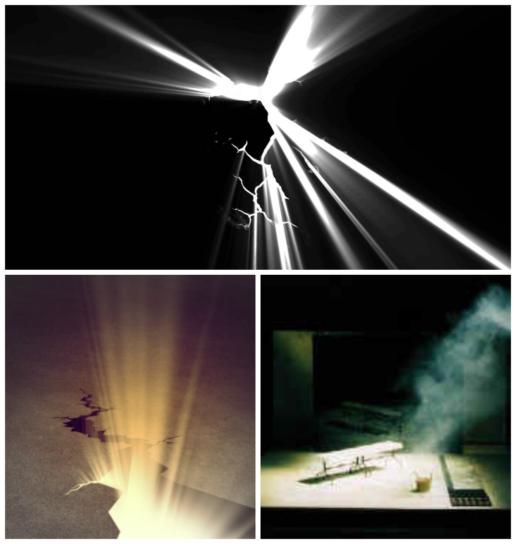
Pantheon took advantage of a back light in order to give a sillhouette effect on the main character. This will in turn give enough light to the outline of the character but not enough to give away too many details. They also made use of white light coming in from behind the set, something that we are looking to use for a similar idea (light coming from behind the cracks of the wall). Using light behind the wall in a dark room will give a beam effect by not revealing too much light but in quantities. The very first picture shows a very effective way of not making a scene too dark, but not too visible by having a tint of blue lighting around. However, this may not be effective for our campaign as the blue can mainly be seen as a sci-fi/futuristic style.

The scene where the main character discovers a crack through the wall, with light beaming through before he punches can be simply done, with a bright light put behind small cracks in the wall. A way to accentuate the light can be done by using smoke and projecting the light through it, that way the light can be visible even in a not so dark room.
 |
| Bronson (2008) |
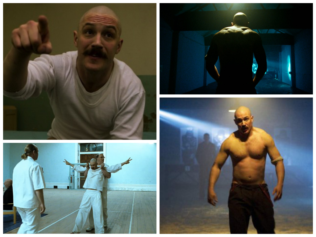
Bronson used many different ways to portray light in various scenes. The still on the bottom left shows a different side to the lighting, which is presented through high key lighting. The light reflecting off the white walls gives the whole set a visible outcome, however there is a contrast to it, allowing for a slightly shadowy look to it (drama/thriller). The images on the right side incorporate a similar style to Pantheon, with low key lighting allowing for a dark set. The bottom right shows a style that makes the character pop, by placing a spotlight on him whilst the background is slightly lit (including the beam). This gives more emphasis on the character on the screen without making the background look less visibly pleasing.
 |
| Alcatraz Prison |
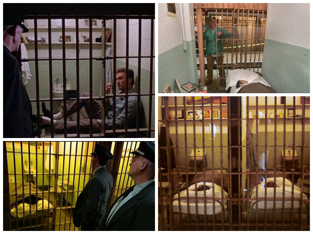
I researched the style of lighting in jail cells from Alcatraz, also including Escape from Alcatraz. As shown in the above images, there can be many different uses of lighting. The jail cells are all well lit, allowing for the guards to monitor what the prisoners are doing at a quick glance.
These two scenes are showing interrogation rooms. The above is a brightly lit room, whereas the other shows a more dark and illusive room. Both of them have different effects, the above being more open and visible (giving us a visual idea of the set, showing the walls and corners of the room), whereas the other is more unpredictable, questioning the audiences knowledge of the set's space.
There is a segment of the storyboard where a guard's shadow lurks over the cradling character on the ground. This can be easily carried out by placing a light facing down and behind the 'guard'. The further away the light, the longer the shadow will be, creating a more eery look for the audience to interpret.
Breaking through the wall scene
For the scene after the character breaks through the wall, I researched various lighting techniques that may be suitable for the scene. As the opening scene features very little colour (mainly monotone in order to represent the tone of the 'restricted from creativity' theme), the next scene will include colour which will interpret breaking free from the metaphorical leash, allowing for a more aesthetic look the scene.
The above pictures are stills from various films (The Wizard of Oz, Fear and Loathing in Las Vegas and The Amazing Spider-Man 2) which give the scene a very vibrant look to them. They are all brightly lit, allowing for the colour to really pop and become highlighted. In addition, the shots can also be colour corrected during post-production (by adjusting the brightness and contrast), allowing it to look more visually appealing on the screen.
Another way to create a visibly pleasing look is similar to Tron, which uses neon colours, mixing black and white but CGI effects allowing for a very digital look on screen. As we are using the green screen, this could be a chance to take advantage of this by incorporating lights digitally, which doesn't affect the character reflection-wise.
http://movieclips.com/eCgmx-the-conversation-movie-bug-hunt/


