Showing posts with label Studio Shoot. Show all posts

Saturday, 21 March 2015

Studio Shoot - Lighting the Set + Evaluation

As my role in the production was to light the set, I liased with the Cinematographer (Charlie) and we decided that we wanted a gloomy/dark, low key style during the opening scene. This would give the scene a depressing/cold feel, indicating to the audience that this is an uncomfortable situation for the character.

We began by using a spotlight facing towards the actor, thus giving us a harsh shadow which projected onto the furthest wall. Two lights were used to fill the rest of the set, however it was a challenge to create this as we didn't want those lights to interfere with the character's shadow (therefore creating multiple shadows).


The shot of the character breaking through into the creative world was a successfully lit scene (I preferred this scene as it turned out as I'd hoped). We used a smoke machine to accentuate the harsh light protruding into the 'Creative world'. The harsh light was intended to simulate the eyes focusing from a dark environment to light, therefore creating a white light in the background.


The TV scene didn't turn out as well as I'd hoped, as the character can barely be seen during this part. The way in which we could have rectified this is by adding a stronger light from behind the TV's, however we had hoped that the TVs would create a strong enough light to create an outline for the actor. We had tried adding a background light with a blue gel, however it didn't produce a strong enough light (as shown in the above picture).

Another flaw I noticed when watching back the footage was the fact that there were a couple of inconsistencies with the shadows during the first scene.

I analysed the above still which is the first shot of the film. The wall behind the actor shows one shadow (also includes the shadow of the guard), however in the same shot we can see another shadow which was created from a different light. This was difficult to fix as we had to use a spotlight in front of the set in order to create the shadow for the right side. The biggest problem for this was the fact that a later shot (picture below) shows that the shadow is harsher on the back wall (as opposed to the left sided wall).


In conclusion , despite the small gripes I had with the consistency of the lighting, I am very happy in the way the film turned out. The amount of effort and teamwork that went into this production is something that I enjoyed and hope to work in a similar kind of work ethic again. 

My role for lighting was a new experience in which I was excited to try and have an input in the way the audience could interpret a scene just by how a set was lit. It was a tricky process to have to try and get the perfect balance of light on set but with the help of Charlie (Cinematographer), Tori (Lighting), Laura (Director) and Chloe (First AD) I was able to get feedback and suggestions on how they thought the scene should be lit. Although it may not be perfect, I believe that the edited footage gave the film an intentionally dark/gloomy look, which alludes to my research on prison films/scenes (such as Bronson and The Dark Knight). I also enjoyed working closely with Charlie as she had a lot of input and advice on how to light the set accordingly. I think that the way to improve on my role on lighting would be to test out some more styles of lighting, however I believe that with the amount of time we had to test the lighting, it was impossible to try all the different styles.

Overall it may not be the most professional looking outcome, but I believe that with the timescale that we had (we only had a day to film without any time for rehearsals), our efforts show on screen and I am pleased with the way it turned out. The teamwork was the main focus of this production and it was great to be a part of it.


Studio Shoot - Set Building

Once the walls were firmly secured and in the correct position for the shoot, we began designing the interior of the prison walls. The crew managed to gather a load of old books from the charity shop, in which we all tore every page from it and sorted them form the lightest to heaviest pages.


We broke off into small teams to work of different parts of the wall. Two people were pasting the pages at a time, whilst two people would stick them onto the walls. To speed up the process, we had an extra person use a brush to go over the pages in order to make sure it stayed stuck on the wall.


As we got closer to the centre of the room (where the bricks would be placed), it was decided that the pages would curve around the centre, indicating to the character that there is something behind the wall. We made sure that every part of the wall was covered completely before continuing on.

We did have a couple problems during this point, as the wallpaper paste on the pages was making it incredibly heavy for it to hold to the wall. Therefore, this created a problem of the pages peeling back. This problem was rectified by using masking tape to secure it into place by sticking it on the top of the wall and over to the other side so the camera wouldn't pick it up during filming.


On the other side of the centre wall, we painted it in black. This would therefore cover the 'wooden' look from behind when shooting it from this side (after the character breaks through).


The foam bricks were brought in to be used as the inner bricks of the wall (of which the character would break through). After a test, it was decided that clay would be the best material to cover them in, as it would give the desired crumble effect once dried. Therefore, a group of us covered all the required bricks with clay by mixing it in water.


 Once dried, we tested the bricks by stacking them in the hole (some bricks had to be cut in half for it to fit). Laura decided that the bricks would look better painted maroon, therefore we began to test out how a clay covered brick would look once painted. We then painted all the bricks and let the dry before continuing.


The outcome (above picture) was achieved by only sticking the side bricks onto the wall therefore allowing the actor to break through the middle without any struggles.


The hole was then to be carefully covered whilst still implementing the curve and keeping the consistency from both sides. We had to make sure that the wall wasn't too heavy that the pages would peel off, however if it was too thin then the bricks would be visible from the other side. Thinner pages were chosen and we used less wall paste in order for it to weigh less.

The final step in creating the set was to tea stain the pages, giving a 'weathered' and 'used' effect.


During the day of filming, we placed the props and took pictures (in which Leanna was in charge of continuity). The mattress was a problem at first because it kept sliding due to the actor's movements during the beginning of the scene. This was rectified by taping the underside of it to the floor, giving it less chance to move when pressured.


Studio Shoot - Lighting the 'Creative World'

After designing the set, we had enough time to test the lighting. As we were testing out the creative world scene with the stacking of the TV's we decided that the light from them will be enough for the scene as it creates a nice outline for the actor.


We wanted the scene to have a contrast between the prison and the creative world. With the TV's being the focal point of the creative world, we had to emphasise on its presence, therefore it was decided that we should make this scene dark in order to allow the light from the TVs to highlight the scene.

We noticed that the lighting on camera may have been too dark as the TVs didn't produce enough light to fill the entire set, making the actor less noticeable. To counter this, we included a light from behind the TVs which allowed the actor to be seen, however due to the bulbs being yellow, it gave it too much of an indoor atmosphere. This then allowed us to decide to use a blue filter, which gave off a more digital and environmentally cool effect. 

Thursday, 6 November 2014

Studio Shoot - Lighting Research

During the first set design session, we were put into groups and discussed ideas for a campaign to promote the DFSA course. The idea that we chose was to focus on the fact that this course gives you possibilities, also allowing you to 'break free' and express yourself.


The idea came from Laura's mention of a straight jacket, in which was the focus of the idea, allowing the audience to realise that the character in the campaign is being restrained from expressing themselves creatively.

My role in the production will be to handle the lighting. I will work closely with the Cinematographer (Charlie), in order to get the appropriate lighting out of particular scenes within the campaign.

Wally Pfister
"The Prestige and Inception are two films that have similar stylistic approaches to the cinematography. Handheld and moving shots, soft side light and central framing of characters are common photographic methods used by Wally Pfister."
http://rowanhopkins.wordpress.com/dp-case-study-wally-pfister/


Pfister has a similar style to most of his collaborations with director Christopher Nolan, where the light allows the character and scene to pop, without placing too much emphasis on one or the other (unless intended). In many of his scenes, he prefers to limit his source lighting (mainly to one source light). The final outcome gives a visually aesthetically vintage look, allowing the scene to look natural to camera and on screen.

Opening Scene (Prison Cell) Lighting Research:
I researched a couple examples from films that relate to the theme (prison/cell) which would give us a rough template for how the lighting should be presented.

Pantheon took advantage of a back light in order to give a sillhouette effect on the main character. This will in turn give enough light to the outline of the character but not enough to give away too many details. They also made use of white light coming in from behind the set, something that we are looking to use for a similar idea (light coming from behind the cracks of the wall). Using light behind the wall in a dark room will give a beam effect by not revealing too much light but in quantities. The very first picture shows a very effective way of not making a scene too dark, but not too visible by having a tint of blue lighting around. However, this may not be effective for our campaign as the blue can mainly be seen as a sci-fi/futuristic style.

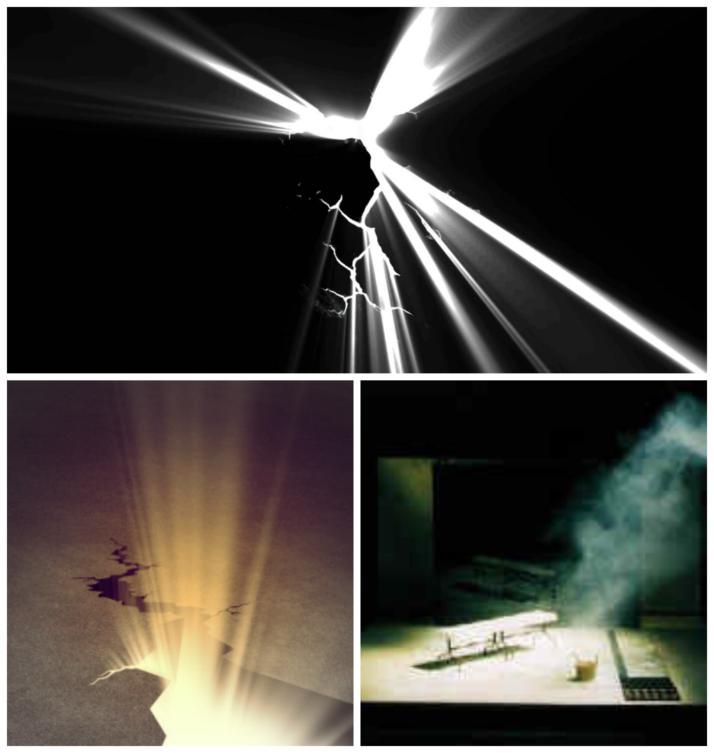
The scene where the main character discovers a crack through the wall, with light beaming through before he punches can be simply done, with a bright light put behind small cracks in the wall. A way to accentuate the light can be done by using smoke and projecting the light through it, that way the light can be visible even in a not so dark room.

Bronson (2008)
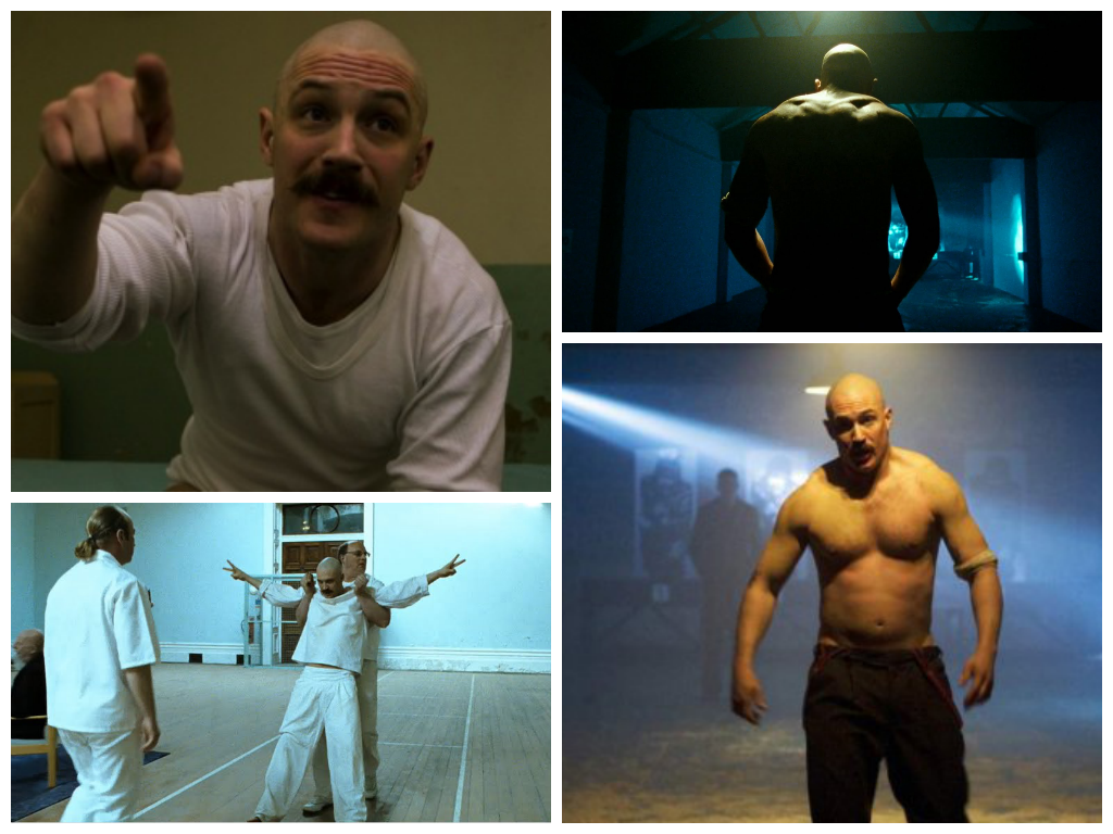
Bronson used many different ways to portray light in various scenes. The still on the bottom left shows a different side to the lighting, which is presented through high key lighting. The light reflecting off the white walls gives the whole set a visible outcome, however there is a contrast to it, allowing for a slightly shadowy look to it (drama/thriller). The images on the right side incorporate a similar style to Pantheon, with low key lighting allowing for a dark set. The bottom right shows a style that makes the character pop, by placing a spotlight on him whilst the background is slightly lit (including the beam). This gives more emphasis on the character on the screen without making the background look less visibly pleasing.

Alcatraz Prison
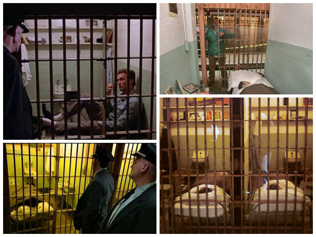
I researched the style of lighting in jail cells from Alcatraz, also including Escape from Alcatraz. As shown in the above images, there can be many different uses of lighting. The jail cells are all well lit, allowing for the guards to monitor what the prisoners are doing at a quick glance.

These two scenes are showing interrogation rooms. The above is a brightly lit room, whereas the other shows a more dark and illusive room. Both of them have different effects, the above being more open and visible (giving us a visual idea of the set, showing the walls and corners of the room), whereas the other is more unpredictable, questioning the audiences knowledge of the set's space.

There is a segment of the storyboard where a guard's shadow lurks over the cradling character on the ground. This can be easily carried out by placing a light facing down and behind the 'guard'. The further away the light, the longer the shadow will be, creating a more eery look for the audience to interpret.

Breaking through the wall scene
For the scene after the character breaks through the wall, I researched various lighting techniques that may be suitable for the scene. As the opening scene features very little colour (mainly monotone in order to represent the tone of the 'restricted from creativity' theme), the next scene will include colour which will interpret breaking free from the metaphorical leash, allowing for a more aesthetic look the scene.

The above pictures are stills from various films (The Wizard of Oz, Fear and Loathing in Las Vegas and The Amazing Spider-Man 2) which give the scene a very vibrant look to them. They are all brightly lit, allowing for the colour to really pop and become highlighted. In addition, the shots can also be colour corrected during post-production (by adjusting the brightness and contrast), allowing it to look more visually appealing on the screen.

Another way to create a visibly pleasing look is similar to Tron, which uses neon colours, mixing black and white but CGI effects allowing for a very digital look on screen. As we are using the green screen, this could be a chance to take advantage of this by incorporating lights digitally, which doesn't affect the character reflection-wise. 

http://movieclips.com/eCgmx-the-conversation-movie-bug-hunt/