JooHee Yoon
I looked at some of JooHee Yoon's illustrations and noticed that he has a style of creating 2D illustrations. In the second picture, he creates depth with the 2D style, allowing for a more dynamic/aesthetic look.
 |
| JooHee Yoon (http://jooheeyoon.com/index.html) |


Hilary White
Her 3D art pieces add a dynamic to the illustrations, also giving depth and a visceral aspect. I wanted to incorporate this into my illustration, using polyboard whilst creating pockets where mp3 players will be stored, allowing the audience to insert headphones into various different parts of the illustration.


I had time to think about the idea again and as I'd gotten into the illustration of the project, I decided to change it again, this time removing the sound aspect and making it a visual piece instead. The reason for this was because the idea to me was either better as a sound piece in itself or just a visual piece.
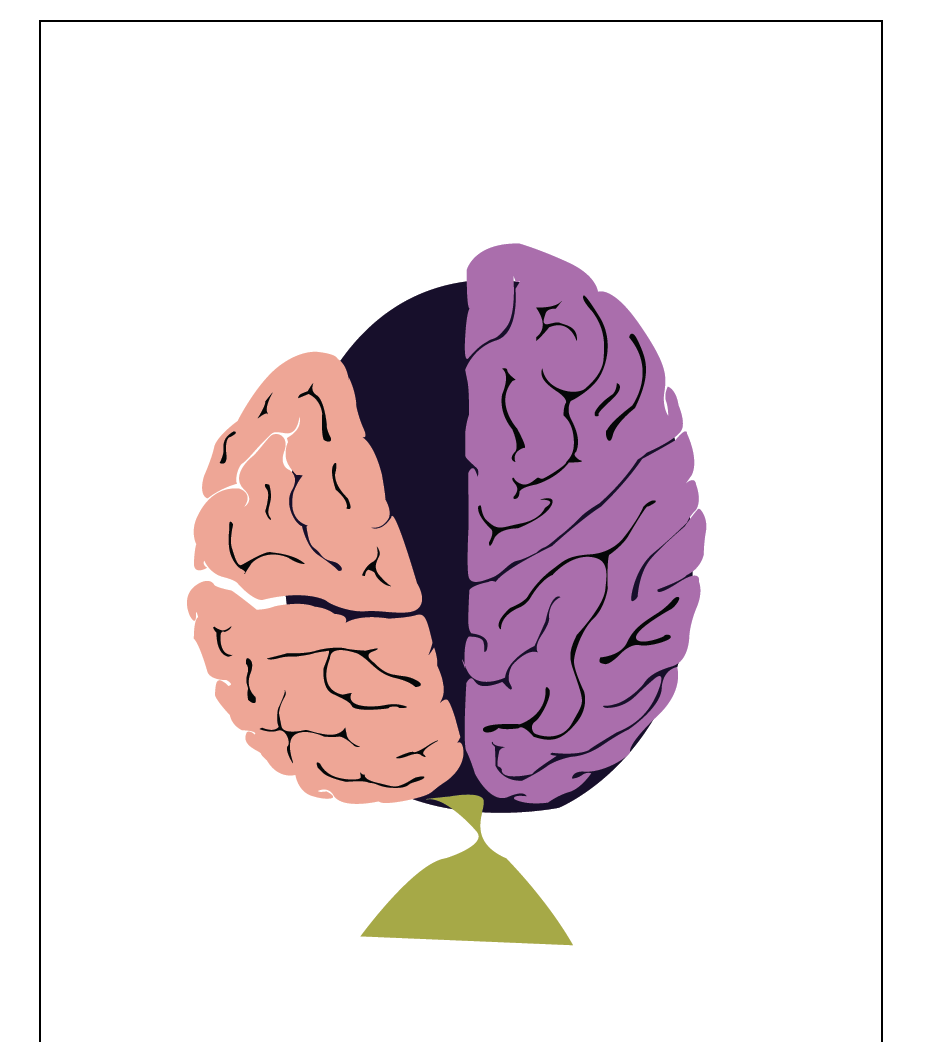
After brainstorming ideas, I came to the realisation that I wanted to create a piece that included illustration including sound, therefore the journey and thought process of an idea was something that I wanted to do. I created a rough illustration which would detail a brain from the top point of view. This would outline the left and right side of the brain (left side being the more logical/statistical thinking side whereas the right side is the more creative/imaginative side of the brain). I was also brainstorming the fact that I would add a simple pathway going in and out of both sides of the brain (detailing the fact that I had to stay grounded to the brief but also creative).
From the above image, it is a screenshot of the base of the piece. The left side of the brain being slightly tilted and sagging due to the heavy demands of the brief, whereas the right side of the brain would be where the pathway would stray towards, as it promotes creativity and imagination. I was thinking of also intersecting the pathway between the two sides which shows unity and a sense of balance.
I had also experimented with adding cracks to show deterioration during a thought process of an idea, in which the brain is visibly struggling to cope with building the idea together.
In addition, I experimented with placing a nail , with ropes theathered to the brain, acting as the brief itself in which it is grounding the idea to the theme.
I had also wanted to incorporate a soundwave to the installation piece, This would give me the reason to add a sound piece to the mix, giving a sense of interactivity to the piece and also space to add the mp3 players into. It also reverts back to my original idea with the Four Doors and environments. I had the idea of having it crumble onto the ground, showing us that the idea in itself hadn't materialised.
After researching different methods, I decided to stick with the brain, however, I wanted to change up the initial idea with the process of an idea, by using a heat map I had seen on TV. This would play into the idea of which part of the brain is used the most (left or right) whilst working on an idea. I would also use Hilary White's 3D art piece as reference to create this 3D heatmap.
This heatmap allowed me to outline the basis of the idea, by Incorporating this into a brain, it will detail the paerts of the brain in which the thought and thinking process happens.
This image helped me with knowing the different parts of which a brain processes certain things, such as sight being at the rear of the brain and movement being at the centre.
I began with using the same outline of the brain from my previous illustration, however I created loads of tiny boxes to create a grid over the outline (keep in mind each of these individual boxes will be cut and places over another outline on a polyboard, creating a 3D piece). Each brain part will be around A3 size, therefore it will be a large piece when placed together.
I came to the conclusion that I wanted to continue on with my previous draft of the 'Journey through the Mind' illustration rather than doing a 3D heatmap of a brain, as this would have been very difficult to create and expensive material wise.
The roads represent the many different ideas I had whilst enduring this unit, twisting and turning between the two sides of the brain differentiating from logical thinking to creative thinking.
The nails represent the theme of the brief, with the ropes holding down the brain, acting as a restriction to the idea. The cracks itself gives an idea of stress and pressure affecting the process of the journey, with the oath having to redirect itself away from it.
The passing of the pathway between both the Left side (logical thinking side) and the Right side (Creatively thinking side) details the indecisiveness of my ideas, based on the fact that I could never settle on a single thought throughout this entire unit.


No comments:
Post a Comment