Saturday, 21 March 2015

Fields and Frames - Cinemagraph

A cinemagraph is a GIF which is made to be a mixture of both footage and still photography. The image would play a certain part i.e. something in the foreground or background, whilst the rest of the image stays still. I am very interested in recreating this technique for fields and frames, as it gives the audience something to focus on (the moving part of the image), whilst appreciating the photographic moment in which the subject is in.

For my first attempt, I took footage of the final moments of a football match (video below 2:13). This was a great shot to practice this skill on as it was presented in slow motion with the camera staying relatively still, giving me the opportunity to track the path of animation. I used photoshop's video editing software to help me track the motion of the video, allowing me to mask over the top intricately.


I opened another layer and used the paintbrush tool to cover Ramsey's arms. This was a long process as I had to fast forward through the frames in order to track all the movements of his arms. 


Once completed, I managed to completely cover his arms and the space in which they would end up by the end of the footage.


I created another layer and copied the final frame of the footage. This would determine the end of the sequence, whereby the tracking of the arms would stop. I then selected the layer in which I painted over his arms and used it as a mask for the final frame layer. Inverting the mask allowed it to cut whatever I had covered (almost like a stencil), allowing for the footage underneath to play. This was the only thing that was animated, as the layer above the footage was still.

My next attempt was to find better suited footage (meaning a more still image/more things happening in the shot). I found a high quality video of a snake biting into a water balloon in slow motion. This gave me more options to track multiple things at once.


The above picture shows the process of painting over the motion of the water droplets and also the movement of the snake. I used the same process as the football player, however I found this footage a lot easier than the previous. This was because the camera was entirely stationary , allowing me to see exactly where the droplets would go without worrying that it would overlap something else through the camera's movement.

For my final attempt, I used footage from Kingsman: The Secret Service. I chose this particular shot because It allowed me to play with the background whilst the movement was smooth and the camera was stationary.


At first, I began to track the character's foot, as she had a simple up and down movement in the background. Once I was happy with the way it turned out, I decided to roughly cover some of the city skyline in the background, as it had a subtle glowing of the city lights and a few cars moving around in the background.


A neat feature of editing footage in photoshop was the fact that I was able to edit it just as I would do a photo. This allowed me to adjust the colour tones and brightness levels to how I wanted it to look.

The final step for all three edits was to export them all into GIF form. This was completed by Saving to Web. I had to fiddle around with the setting quite a lot which allowed me to change the size of the image and how I wanted it to loop.

My first attempt at saving the GIF had a couple problems. I kept getting errors as the file was deemed too large to export. This prompted me to lower the width of all the GIFs to 1000, thus fixing the situation without lowering the quality or looking too small. I set the loop from "once" to "forever", making certain that it wouldn't stop after the first view.


Final Exports


After viewing the first GIF i made, I was happy with the attempt but I believe this was a difficult one to achieve as there were far too many things moving behind the player, therefore the masking included the backgrounds of the fans and the opposing player's shoulder running behind him.


The snake bite was an improvement on the previous one, as it was easier to complete due to less things moving in the background. The tracking of the water droplets on the right side of the GIF have room for improvement, as they just randomly disappear behind the still droplets. Despite this, I still believe it has a nice effect.


The Kingsman GIF was probably the most successful out of the three, as it was a simple movement to track and is effective. Although not very noticeable, the city lights in the background add a nice touch to the piece.

Studio Shoot - Lighting the Set + Evaluation

As my role in the production was to light the set, I liased with the Cinematographer (Charlie) and we decided that we wanted a gloomy/dark, low key style during the opening scene. This would give the scene a depressing/cold feel, indicating to the audience that this is an uncomfortable situation for the character.

We began by using a spotlight facing towards the actor, thus giving us a harsh shadow which projected onto the furthest wall. Two lights were used to fill the rest of the set, however it was a challenge to create this as we didn't want those lights to interfere with the character's shadow (therefore creating multiple shadows).


The shot of the character breaking through into the creative world was a successfully lit scene (I preferred this scene as it turned out as I'd hoped). We used a smoke machine to accentuate the harsh light protruding into the 'Creative world'. The harsh light was intended to simulate the eyes focusing from a dark environment to light, therefore creating a white light in the background.


The TV scene didn't turn out as well as I'd hoped, as the character can barely be seen during this part. The way in which we could have rectified this is by adding a stronger light from behind the TV's, however we had hoped that the TVs would create a strong enough light to create an outline for the actor. We had tried adding a background light with a blue gel, however it didn't produce a strong enough light (as shown in the above picture).

Another flaw I noticed when watching back the footage was the fact that there were a couple of inconsistencies with the shadows during the first scene.

I analysed the above still which is the first shot of the film. The wall behind the actor shows one shadow (also includes the shadow of the guard), however in the same shot we can see another shadow which was created from a different light. This was difficult to fix as we had to use a spotlight in front of the set in order to create the shadow for the right side. The biggest problem for this was the fact that a later shot (picture below) shows that the shadow is harsher on the back wall (as opposed to the left sided wall).


In conclusion , despite the small gripes I had with the consistency of the lighting, I am very happy in the way the film turned out. The amount of effort and teamwork that went into this production is something that I enjoyed and hope to work in a similar kind of work ethic again. 

My role for lighting was a new experience in which I was excited to try and have an input in the way the audience could interpret a scene just by how a set was lit. It was a tricky process to have to try and get the perfect balance of light on set but with the help of Charlie (Cinematographer), Tori (Lighting), Laura (Director) and Chloe (First AD) I was able to get feedback and suggestions on how they thought the scene should be lit. Although it may not be perfect, I believe that the edited footage gave the film an intentionally dark/gloomy look, which alludes to my research on prison films/scenes (such as Bronson and The Dark Knight). I also enjoyed working closely with Charlie as she had a lot of input and advice on how to light the set accordingly. I think that the way to improve on my role on lighting would be to test out some more styles of lighting, however I believe that with the amount of time we had to test the lighting, it was impossible to try all the different styles.

Overall it may not be the most professional looking outcome, but I believe that with the timescale that we had (we only had a day to film without any time for rehearsals), our efforts show on screen and I am pleased with the way it turned out. The teamwork was the main focus of this production and it was great to be a part of it.


Studio Shoot - Set Building

Once the walls were firmly secured and in the correct position for the shoot, we began designing the interior of the prison walls. The crew managed to gather a load of old books from the charity shop, in which we all tore every page from it and sorted them form the lightest to heaviest pages.


We broke off into small teams to work of different parts of the wall. Two people were pasting the pages at a time, whilst two people would stick them onto the walls. To speed up the process, we had an extra person use a brush to go over the pages in order to make sure it stayed stuck on the wall.


As we got closer to the centre of the room (where the bricks would be placed), it was decided that the pages would curve around the centre, indicating to the character that there is something behind the wall. We made sure that every part of the wall was covered completely before continuing on.

We did have a couple problems during this point, as the wallpaper paste on the pages was making it incredibly heavy for it to hold to the wall. Therefore, this created a problem of the pages peeling back. This problem was rectified by using masking tape to secure it into place by sticking it on the top of the wall and over to the other side so the camera wouldn't pick it up during filming.


On the other side of the centre wall, we painted it in black. This would therefore cover the 'wooden' look from behind when shooting it from this side (after the character breaks through).


The foam bricks were brought in to be used as the inner bricks of the wall (of which the character would break through). After a test, it was decided that clay would be the best material to cover them in, as it would give the desired crumble effect once dried. Therefore, a group of us covered all the required bricks with clay by mixing it in water.


 Once dried, we tested the bricks by stacking them in the hole (some bricks had to be cut in half for it to fit). Laura decided that the bricks would look better painted maroon, therefore we began to test out how a clay covered brick would look once painted. We then painted all the bricks and let the dry before continuing.


The outcome (above picture) was achieved by only sticking the side bricks onto the wall therefore allowing the actor to break through the middle without any struggles.


The hole was then to be carefully covered whilst still implementing the curve and keeping the consistency from both sides. We had to make sure that the wall wasn't too heavy that the pages would peel off, however if it was too thin then the bricks would be visible from the other side. Thinner pages were chosen and we used less wall paste in order for it to weigh less.

The final step in creating the set was to tea stain the pages, giving a 'weathered' and 'used' effect.


During the day of filming, we placed the props and took pictures (in which Leanna was in charge of continuity). The mattress was a problem at first because it kept sliding due to the actor's movements during the beginning of the scene. This was rectified by taping the underside of it to the floor, giving it less chance to move when pressured.


Studio Shoot - Lighting the 'Creative World'

After designing the set, we had enough time to test the lighting. As we were testing out the creative world scene with the stacking of the TV's we decided that the light from them will be enough for the scene as it creates a nice outline for the actor.


We wanted the scene to have a contrast between the prison and the creative world. With the TV's being the focal point of the creative world, we had to emphasise on its presence, therefore it was decided that we should make this scene dark in order to allow the light from the TVs to highlight the scene.

We noticed that the lighting on camera may have been too dark as the TVs didn't produce enough light to fill the entire set, making the actor less noticeable. To counter this, we included a light from behind the TVs which allowed the actor to be seen, however due to the bulbs being yellow, it gave it too much of an indoor atmosphere. This then allowed us to decide to use a blue filter, which gave off a more digital and environmentally cool effect. 

Thursday, 12 March 2015

Maya 3D - Creating the Spaceship

For the first session, I was required to create a 3D spaceship on Maya. This was a fairly simple process. The 'extrude' tool was essential in making this, as it allowed me to drag objects out of another.

The first step was to create a cube. I used the scale tool to expand it to the length that I was happy with. By selecting a face, I was able to use the extrude tool simultaneously with the scaling tool in order to drag out another object from the cube. This allowed me to create the wings of the spaceship. I was then able to drag the wing to the side in order to make it look more authentic. The front of the spaceship was extruded outwards and scaled down for it to have a slope.


The next step was to create the indents on the ship. This, again, used the extrude tool in order to scale down a face of an object and then dragged inwards, therefore creating a gap inside.

I made sure that the holes were on both the front and back of the ship (where the thrusters would go).


 Once completed, I had a solid look for the spaceship, which would be the base of the design. However, to make it look less clunky, I used the 'mesh' option by selecting the whole object and holding spacebar. This gave me the option to smooth the object once selecting form the mesh menu. I changed the division levels to 3 and applied it to the object, thus giving me a more curved and natural looking object.


I was happy with the overall look of the spaceship, therefore the next step was to create the texture. I used the Blinn material by highlighting the entire spaceship and changing its colour to Jet black. I then decided to colour in the holes where the spaceship's engines would be.

For this process, I selected the face option and used the paintbrush tool to select the inside of the hole. I then neatened the selection by using the shift key and single selecting areas which were unselected. Once i was happy with the selection, I changed the colour to a light blue, giving a futuristic/sci-fi look. I noticed that some of the blue had come through on the other side. To fix this I had to select the affected areas and re-colour them black. I repeated this process to each of the holes in order to get the final outcome. (pictures below).


Thursday, 5 March 2015

Professional Toolkit - Photography - Broad and Narrow Lighting


During the photography workshop in the studio, we gained vital tips on the way lighting has a great effect on the way a picture can be perceived due to the positioning of a subject.

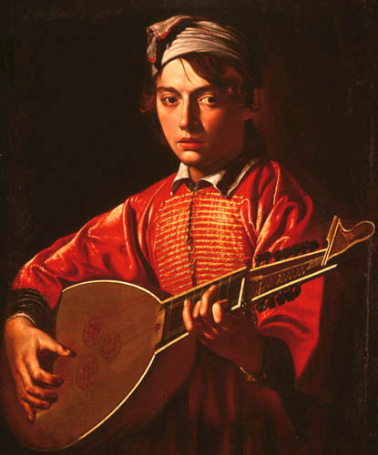
We looked at paintings of Rembrandt Harmenszoon van Rijn and Michelangelo Merisi Caravaggio, in which they utilised two different techniques of lighting in order to give off a certain style.

Narrow Lighting - This refers to when the lighting highlights the side of the subject which defines the cheekbone, creating shadows and allowing for a more dramatic/picturesque outcome. One side of the nose will be lit whereas the other side will be shadowed, allowing the subject to look more aesthetically pleasing.

Broad Lighting - This refers to the lighting in which it fills the side of the subject's face by highlighting all areas of their face. This in turn gives the picture a unique element, in which the subject's facial details are more present to the viewer.

Rembrandt's paintings utilised the use of broad lighting by filling the subject's face with light that highlighted their features in order to show their heritage. This in turn gives the viewer the knowledge that the paintings represented a real person i.e. The person in the painting wanted their nose to be prominent so the viewer knows that they come from a long line of people with similar noses.


Caravaggio's paintings used a more dramatic approach, highlighting the narrow side of the face. this will therefore create shadows around the cheekbones and under the eyes, which brings forth more of a 'captured moment'.


During our studio shoot, we were tasked with trying to replicate the broad and narrow lighting techniques. We were split up into groups and tested the lighting on two subjects. We were given advice from Beytan on how to direct during a photoshoot, such as using your hand to show the person where to look and not being afraid to manipulate their hair (as long as we had permission to touch first).


The above picture was a narrow lighting shot, in which we positioned the light to the subject's right side. We then got her to turn her head slightly in order to create a shadow under the cheekbone. It was also vital to get the studio lights reflected from her pupils.


The second picture is one I took in which the lighting is broad. This details the subject's cheek, covering most of the face and showing more of the facial features.